In An Alternate Universe, What Fonts are Justin and Patrick?
May 01, 2017
Requested Blog Topic: In another dimension Justin and Patrick are fonts. What kind, and are they complementary or competing? Yeah, we know this one is a little nerdy but we feel we are up to the challenge. Thank you to Dave Conover for the question.
What Font Are You?
By Justin Skeesuck and Patrick Gray
Justin's Choice for Patrick:

When my good friend, Dave Conover, first asked us this question, we figured the answer would appeal to a limited audience. Being a graphic designer for years, I know that conversations surrounding fonts tend to bore anyone not in my world. But the more we dug into this, the more interesting things became. We decided to pick a typeface for each other and explain the rationale separately. I will let Patrick share his perspective in a few minutes. First though, in this alternate dimension Patrick is definitely Helvetica.
It didn’t take me long to figure this out. Helvetica is a typeface that has been with me throughout my design career. Tried and true, Helvetica so often works when other fonts don’t. It’s just always been there and always works. If there ever were a typeface a designer could call loyal, it would be Helvetica. It’s tall and lanky, much like Patrick. The straight lines, strong presence, and universal application find this font on everything from signs to books, CD’s to vinyl, and airports to farm equipment. Wherever my design career chose to go, Helvetica was willing to make the journey, much like my best friend. The hard projects, the difficult clients, the scary years stepping out on my own as an independent graphic designer. Every step of my feet and roll of my wheels, every phase of my life, good and bad, fun and hard, Patrick has been Helvetica.
Patrick's Choice for Justin:
So… I’m not a designer. But I know a guy. For the record, I just cracked myself up.
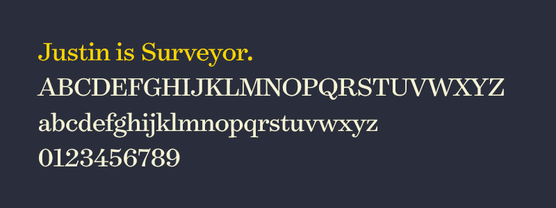
While I’m not an artist, I am a writer and have always had an obsession with words. Not just the words themselves, but also the way in which they are used visually. The power a font has in bringing a word to life is something I have grown to appreciate over the years. The shape fonts take in the pages of a book and the contrast they create with a logo allow a single word to have multiple layers, multiple meanings. While Helvetica, Minion, Gotham and Tungsten are some of my favorite fonts; Justin is definitely Surveyor.
A typeface that was born out of text used in old school maps is such a perfect fit. Justin has always had a fascination with maps. But what are more interesting are the shared qualities. Surveyor has warmth about it, a depth that invites people to read more, to lean in and explore the words on a map, on a globe, or within a book. Versatile, Surveyor comes alive when used in new ways, when stretched. Words almost seem to transform as they arch across a mountain range or fit tightly along a stream. Much like Surveyor, Justin’s art, and his life, mold, adapt, and transform.
Justin’s obsession with originality (not to be different, but to be true to himself) has made so many of his pieces stand out from other artists. Each piece has a handmade feel about it. Much like surveyor, much like his life, everything feels original. Never afraid to take on the biggest of challenges, Justin and Surveyor make everything they touch come alive.
To answer Dave’s final question about our font alter egos in this alternate dimension, “… and are they complementing or competing?”
You decide.
Stay connected with news and updates!
Join our mailing list to receive the latest news and updates from our team.
Don't worry, your information will not be shared.
We hate SPAM. We will never sell your information, for any reason.

